NASA has been detecting weekly changes in sea level for 33 years
Satellites have tracked week-by-week changes in sea level for 33 years, and NASA has now opened the record.
That public stream exposes sudden bumps and dips that can worsen coastal flooding well before yearly averages show the change.
Weekly sea level record goes public
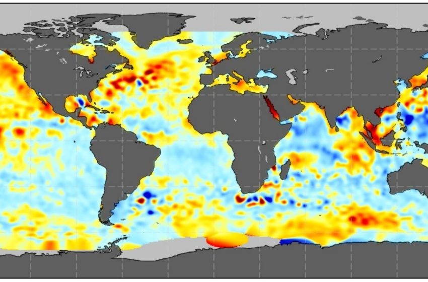
NASA posted weekly maps from NASA Sea Surface Height products (NASA-SSH) that show where the surface sat higher or lower than normal.
Oceanographer Dr. Joshua K. Willis built his career around measuring the ocean’s height with satellites, then refining the record for public use.
At NASA’s Jet Propulsion Laboratory (JPL), his group aligned multiple missions so the weekly numbers stayed comparable.
Opening the record removes the old delay between research labs and public users who need to track fast-moving risks.
Satellites measured ocean height
Orbiting spacecraft measured ocean height by timing radar pulses that bounced off the sea surface.
A radar altimeter, an instrument that times radar echoes from water, returned one reading about each second.
Each snapshot covered a patch about 3 to 6 miles (4.8 to 9.7 kilometers) wide, smoothing out individual waves but keeping large patterns.
Those raw tracks alone could not explain local flooding, because land motion and tides still moved coastlines up and down.
Turning tracks into grids
Computers then turned those satellite tracks into NASA-SSH grids on a fixed layout, which made changes easier to compare over time.
Programmers blended 10 days of observations into each grid, so one map captured nearly a full repeat cycle.
They placed the results on a 0.5-degree grid, and smoothed nearby points across about 62 miles (100 kilometers) to reduce noise.
Because each map reused some days from the next one, quick spikes sometimes appeared softened rather than sharply bounded.
Keeping oceans from mixing
Land boundaries forced the team to treat the ocean as separate basins, not as one smooth surface.
Software labeled every point with a basin flag, a number that marks an ocean region, so maps avoided cross-basin mixing.
A connection table let neighboring basins share data when water truly connected, while barriers like the Isthmus of Panama blocked sharing.
That rule protected coastal details, but it also meant some narrow straits could still limit smoothing and leave small gaps.
Weekly sea level maps capture change
Each map tracked a sea surface height anomaly, the difference from a long-term ocean average, which reflected currents and heat.
When warm water piled up, the surface rose because the water expanded and moved, and satellites captured that lift within days.
During events such as El Nino, those week-to-week swings helped scientists watch heat spread across the Pacific without waiting for monthly summaries.
Local agencies still needed tide gauges for street-level flooding, yet the weekly view improved early warnings for larger regional surges.
Heat swells ocean water
In 2024, global sea level rose 0.23 inches (0.58 centimeters) per year. That jump came mostly from thermal expansion, water takes up more space when warm, after winds mixed heat deeper than usual.
Scientists estimated that two-thirds of the 2024 sea level rise came from warming water, reversing the usual balance with melting ice.
“Every year is a little bit different, but what’s clear is that the ocean continues to rise, and the rate of rise is getting faster and faster,” said Willis.
A faster long-term climb
Beyond short-term swings, the long record includes Sentinel-6 readings, and it shows the ocean rising faster over time, not steadily.
One paper traced rates from about 0.08 inches (0.2 centimeters) per year in 1993 to about 0.18 inches (0.46 centimeters) in 2023.
Greenhouse gases warmed the ocean and melted land ice, adding water and swelling seawater so each decade piled on rise more quickly.
That acceleration set the baseline for every weekly map, yet future years could speed up or slow down with natural variability.
Limits baked into maps
Weekly sea level maps still came with tradeoffs, because space-based sensors cannot watch every coastline at street scale.
Reference orbits left gaps near the poles, and the gridded maps resolved features only about 200 miles (322 kilometers) across.
The processing also added about two weeks of delay, and each weekly file overlapped the next in time.
Users who tracked storms needed to remember that the product showed broad patterns, not the exact peak on a given day.
Using the sea level data responsibly
Interpreting the NASA-SSH maps required care, because the values were anomalies rather than absolute sea level at a pier.
The maps reported heights relative to a mean, so a geocentric sea level, measured from Earth’s center of mass, stayed comparable across satellites.
Coastal flooding depended on local land motion and tides, so users had to pair the maps with tide gauges.
Handled well, the dataset supported research and planning, but careless reading could turn a regional signal into a false local alarm.
Next steps for weekly maps
Open weekly sea level maps tightened the link between JPL scientists, satellites, and coastal decisions by making change visible every week.
As follow-on missions extend the record, public users will need tools that translate anomalies into practical risk checks.
Information from a NASA press release.
—–
Like what you read? Subscribe to our newsletter for engaging articles, exclusive content, and the latest updates.
Check us out on EarthSnap, a free app brought to you by Eric Ralls and Earth.com.
—–
First Appeared on
Source link

