The Google Clock app is solving its wallpaper problem
Hadlee Simons / Android Authority
TL;DR
- Clock is dialing back its support for wallpaper backgrounds, to make sure you can still read the time.
- Google’s also beginning to remove references from Assistant within the app.
- Going forward, we may see a new “pulsing” effect for the time.
These past few months have been busy ones for many of Google’s Android apps, as the company has been sprucing up their looks with a fresh touch of Material 3 Expressive. While we’ve generally been fans of the changes, not every swing in this Expressive direction is going to be a hit. And even though we saw Google take a very slow, measured approach to deploying these updates, some of those less-than-successful tweaks have managed to slip through to public releases. The good news is that Google is learning from your feedback, and already appears to be correcting just such an oversight.
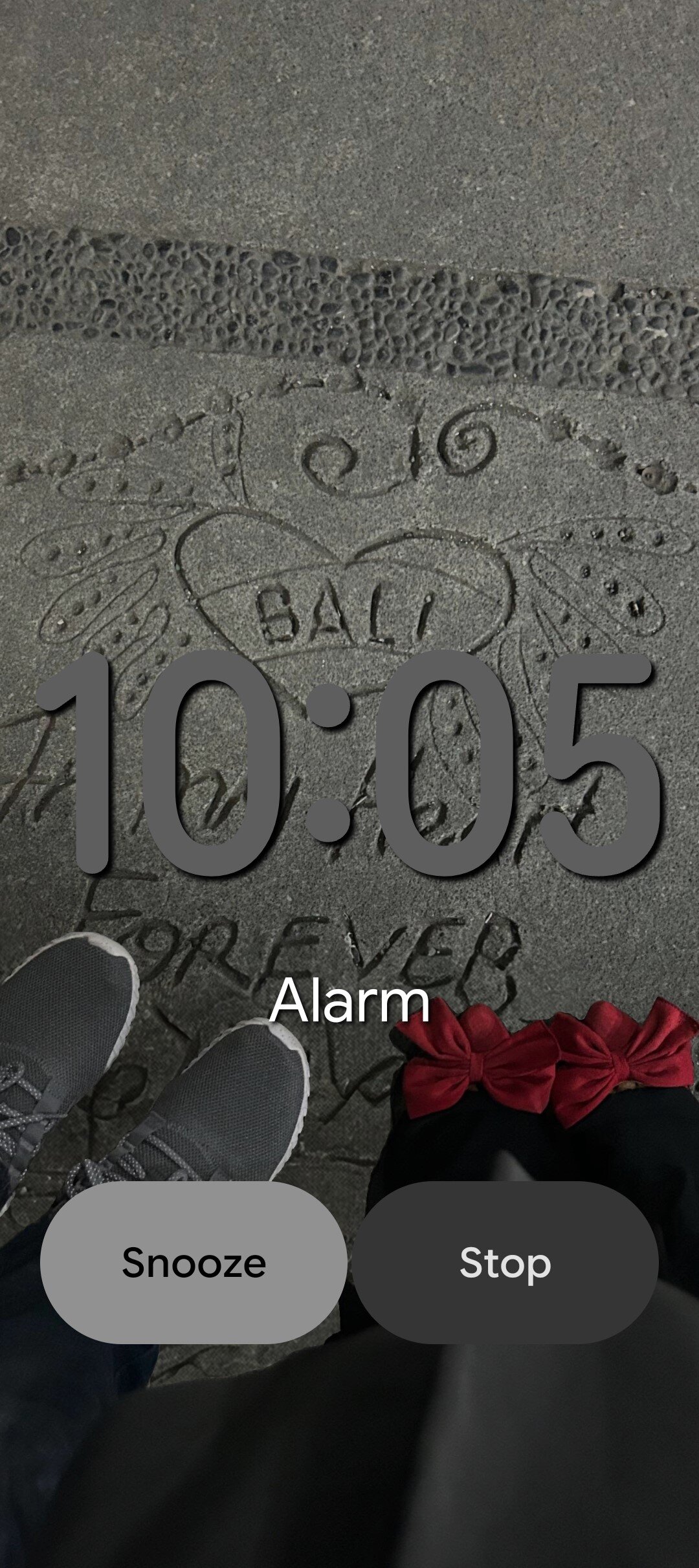
When that looks good, that looks good, and we didn’t immediately see any problem there. But it’s very difficult to account for all edge cases right out of the gate, and once this finally went live, it didn’t take long for users to finally start pointing out problems, like in this Reddit post from user saahil20:

That gray-on-gray is really an unfortunate color pairing, and especially if you’re just waking up with a head still full of fog, we can’t imagine that’s going to be very easy to read at a glance.
The good news? Google’s in the process of undoing this change. With version 8.3 of Google’s Clock app, we’re once again seeing our alarm screen against a solid background.
If you weren’t having any issues with colors, you might not love that change, but we find it hard to fault Google for (eventually) choosing to err on the side of legibility.
Beyond that tweak, we’ve also spotted a couple other interesting differences with this new release. For one, we get a touch of the ongoing Gemini-fication of all things previously Assistant.
It’s not huge, but the option to run a routine after your alarm goes off is beginning to drop its Assistant branding, appearing now as just “Routines.”
That one’s already beginning to hit users, but for our final change we’re looking at something that’s not yet visible in the app. We’ve uncovered developer progress towards a new, pulsing animation for the time.
Here, you can see the weight of the lines forming those numerals grow thicker and thinner, for an eye-catching look.
We can’t yet say when this might start showing up, but look for these other tweaks hitting your phone soon, as you get Google Clock 8.3.
⚠️ An APK teardown helps predict features that may arrive on a service in the future based on work-in-progress code. However, it is possible that such predicted features may not make it to a public release.
Thank you for being part of our community. Read our Comment Policy before posting.
First Appeared on
Source link


