![Google TV homescreen redesign – here’s what it looks like [Gallery]](https://isenews.com/wp-content/uploads/2025/11/1763061944_google-tv-homescreen-2025.jpg)
Google TV homescreen redesign – here’s what it looks like [Gallery]
While it’s still not widely available, the Google TV homescreen redesign is rolling out to more users. Here’s a closer look at what’s changed.
We first reported on a redesign to the Google TV homescreen in September, with the update primarily being focused on new navigation and some reorganization. The update was officially acknowledged by Google, but it’s yet to be widely rolled out. There have been reports here or there, but it did just appear on two of our Google TV Streamers.
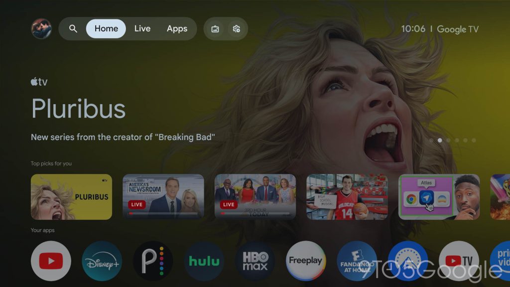
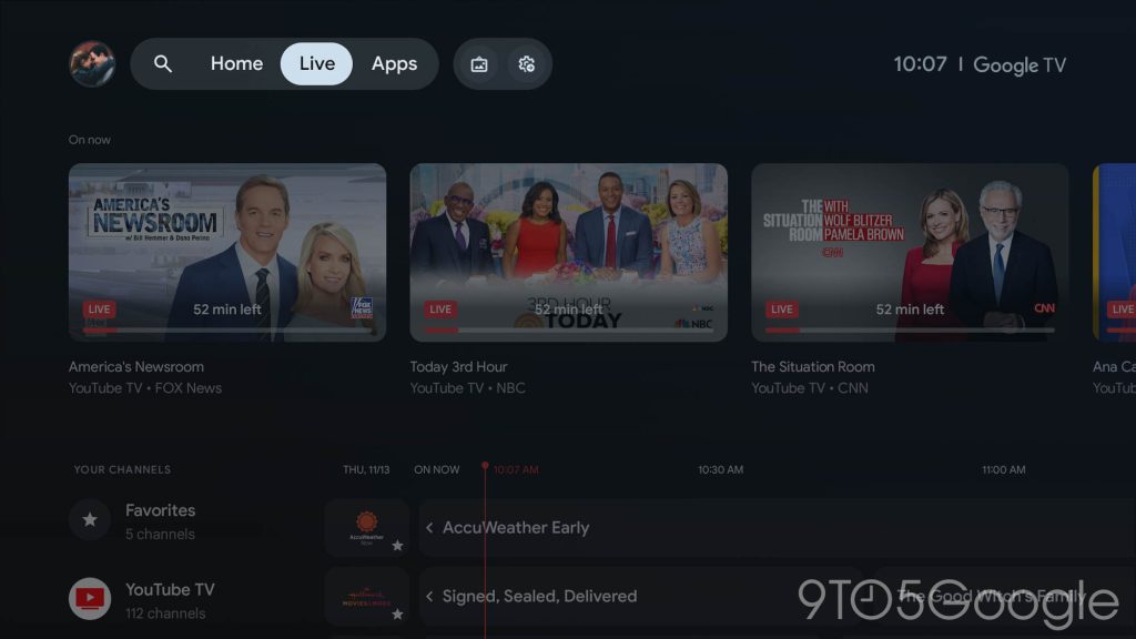
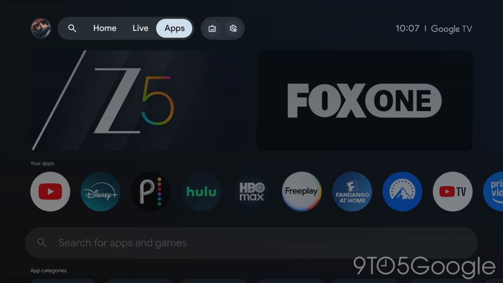
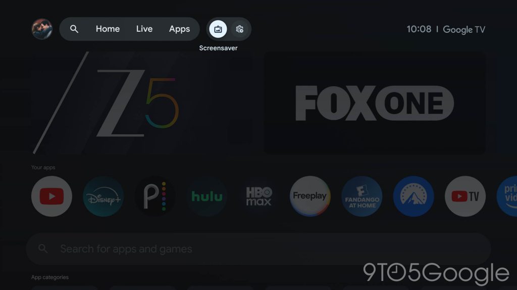
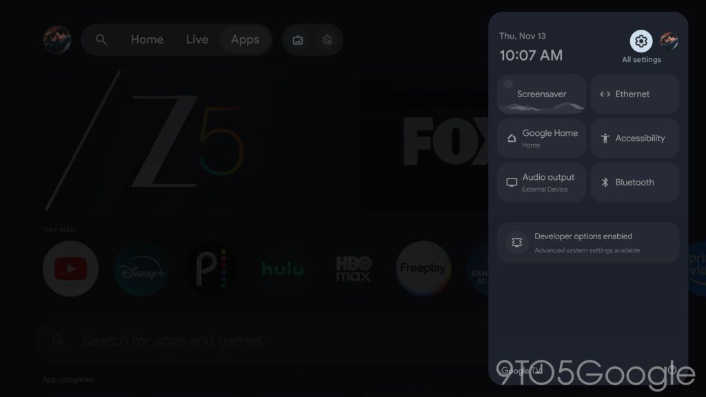
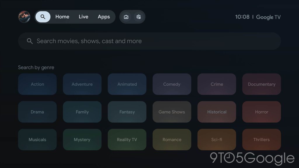
The Google TV homescreen redesign, as mentioned, is mainly a reorganization. The top bar now shows fewer tabs, limiting itself ot just “Home,” “Live,” and “Apps.” The navigation bar also has icons for search, screensaver, and quick settings.
So where did everything else go?
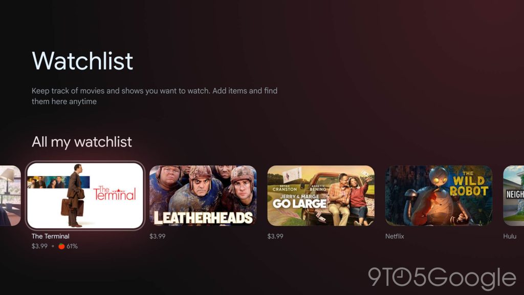
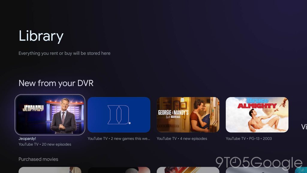
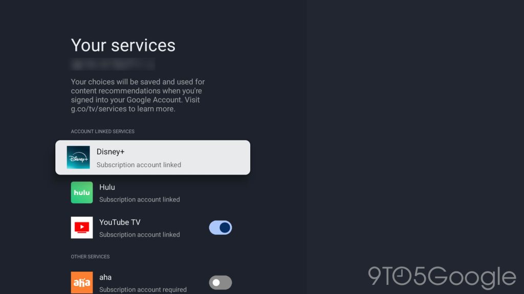
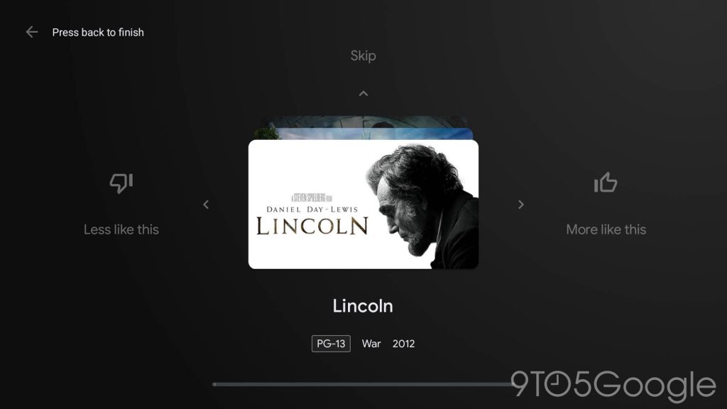
Under your profile menu, Google TV now lists out your watchlist, library, services, and content preferences. The “Watchlist” and “Library” have also been redesigned as siloed interfaces with a large header and a horizontally-scrolling list of content. That, sadly, leaves one of our biggest complaints about the Google TV Library unfixed.
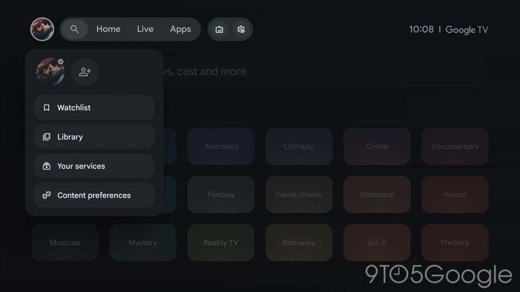
The pages for “Content preferences” and “Your services” are left unchanged, as is the case for the “Search” tab.
Notably, too, this homescreen revamp is rolling out independently of the Gemini update. While Google announced the Gemini rollout for Google TV Streamer earlier this week, both of our units are still on Assistant despite having the redesign in place.
Do you have the Google TV homescreen redesign yet? What do you think about the changes?
More on Google TV:
Follow Ben: Twitter/X, Threads, Bluesky, and Instagram
FTC: We use income earning auto affiliate links. More.
First Appeared on
Source link

