Chrome for Android rolls out M3 Expressive redesign
The rollout of Chrome’s M3 Expressive redesign, which began in late August, is now complete. It comes a few weeks after most first-party apps have received their updates.
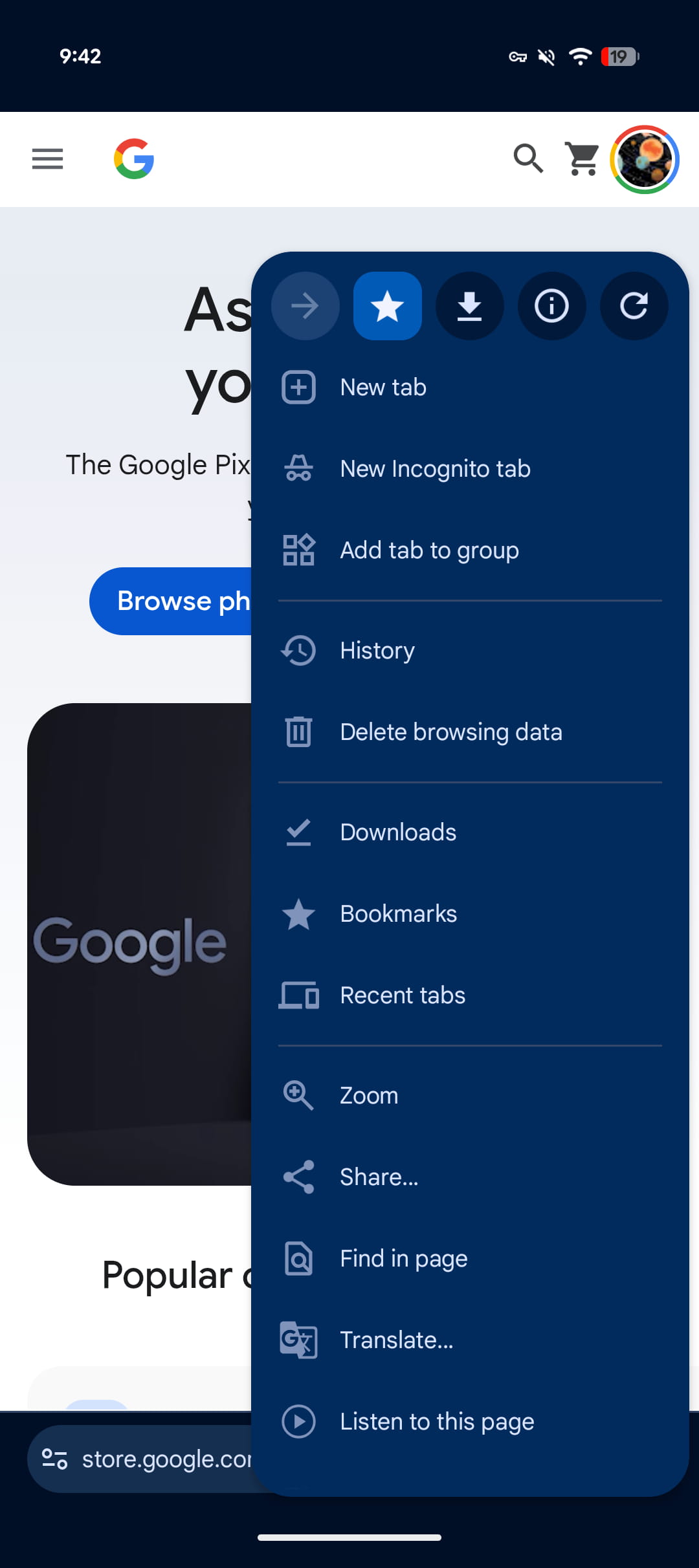
Opening the three-dot overflow menu reveals how Chrome has placed the forward, bookmark, download, site info, and refresh buttons in circular containers at the top. The star icon’s background becomes a rounded square when visiting a saved page. This helps those actions stand out against the ever-growing list.
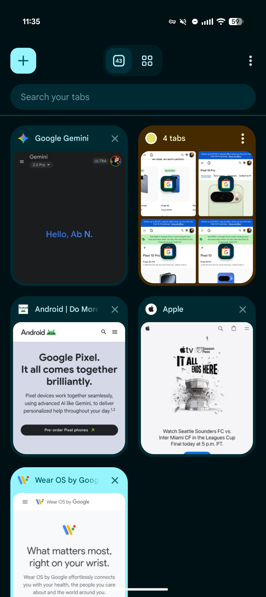
On the Tab Grid, the new tab ‘plus’ is placed in a rounded square with a Dynamic Color background. The tab, Incognito (when active), and Groups switcher gets its own container with a rounded square used to note the current section. Tab Groups are now themed with the color you’ve selected to help distinguish them.
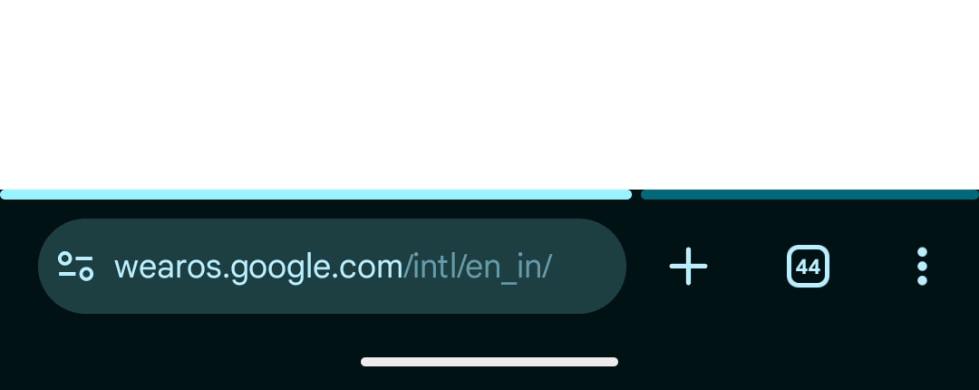
Chrome tested a touch of Material 3 Expressive in the address bar, but this is not fully rolled out. For some, the Omnibox uses a split/segmented progress indicator with rounded “corners” as pages load.
In adding Material 3 Expressive components, Chrome did not increase the size of these buttons. As such, everything is much smaller than updated interfaces in other apps. This fits how the Chrome UI has not significantly changed across Google’s various design language updates.
This M3 Expressive redesign widely rolled out as a server-side update with Chrome 141 for Android. If you don’t see it, be sure to Force stop the browser from App info.
More on Chrome:
FTC: We use income earning auto affiliate links. More.
First Appeared on
Source link

