These are the Office icons Microsoft rejected
Microsoft is busy rolling out new curvy and colorful new Office icons, and now it’s revealing a set of design concepts it experimented with before finalizing these new icons. Some of the concepts are radically different from what Microsoft is shipping, with design explorations for Word, Excel, and PowerPoint that more closely resemble the Office for Mac icons of the past.
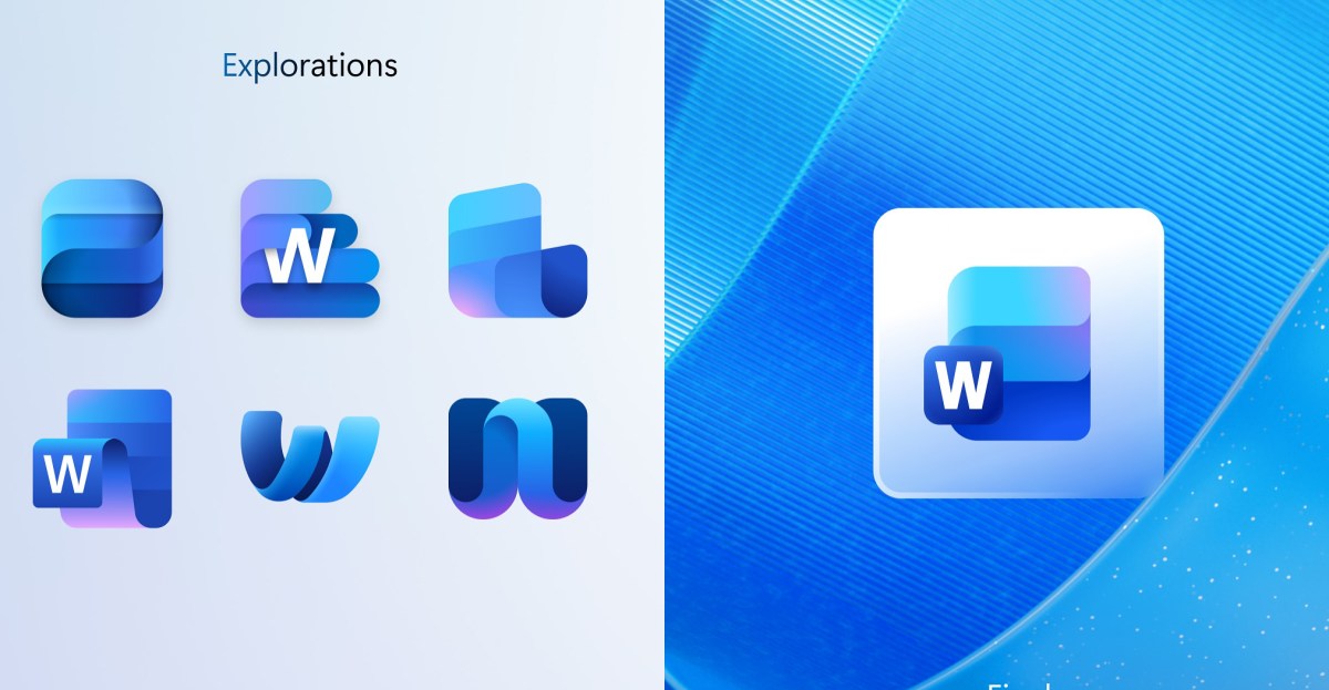
The Word concept icons (above) include a notepad-like experiment and different ways to visualize stacks of paper, or documents. Microsoft experimented with making the Word lettering the key part of the icon, and also versions where the lettering blends in or is totally absent. Microsoft eventually settled on a design that has three horizontal bars instead of four, and it’s using versions of the icon with and without lettering.
Microsoft focuses heavily on the use of cells in its existing and new Excel icons, and the concept ones rarely diverge from this. I really like the X icon though, but the rest look similar to what Microsoft landed on for the final icon.
PowerPoint has always been about slides, and Microsoft experimented with a variety of ways of visualizing that for its latest PowerPoint icon. A couple of concepts focus on the lettering, turning into a ribbon-like P or a P letter with a pie chart hanging off of it. The final icon design is a lot more tame though, with a slightly more rounded and colorful take on the current PowerPoint icon.
All of Microsoft’s new Office icons — including new Teams, OneDrive, Outlook, and OneNote designs — are starting to roll out across Windows and iOS at the moment. Microsoft appears to be using the versions with letters in Windows, but for iOS it’s opting for icons without the distinctive letters.
What do you think? Are there any concept versions you prefer over the final designs Microsoft picked?
First Appeared on
Source link

